For the Love of Paper with Ryann Carey (One Artist’s Advice on Watercolor Paper)
If I had $10:
I would spend $7 on paper, $2 on paint, and $1 on a brush.
I can geek out about any art supply – paper, however, holds a special place in my heart. When I found the right paper for me it was like love at first sight (or brush if we want to get technical).
I remember the first time I painted on 300 lb cold press paper. I was taking a watercolor class at Durham Tech and it was designed like any other college class. The focus was on assignments and critiques. Students are young (except me) and want/need to be frugal. So for 90% of the class, I painted on, well, student grade paper. Near the end of class my teacher suggested trying 300 lb paper.
I headed over to the art supply store and found it. I swiftly transformed into the eye-popping cartoon character. Awooga, Awooga! I really was unaware that paper could have this kind of price tag – silly me. I balanced the checking account in my head, made justifications, and headed to the register.
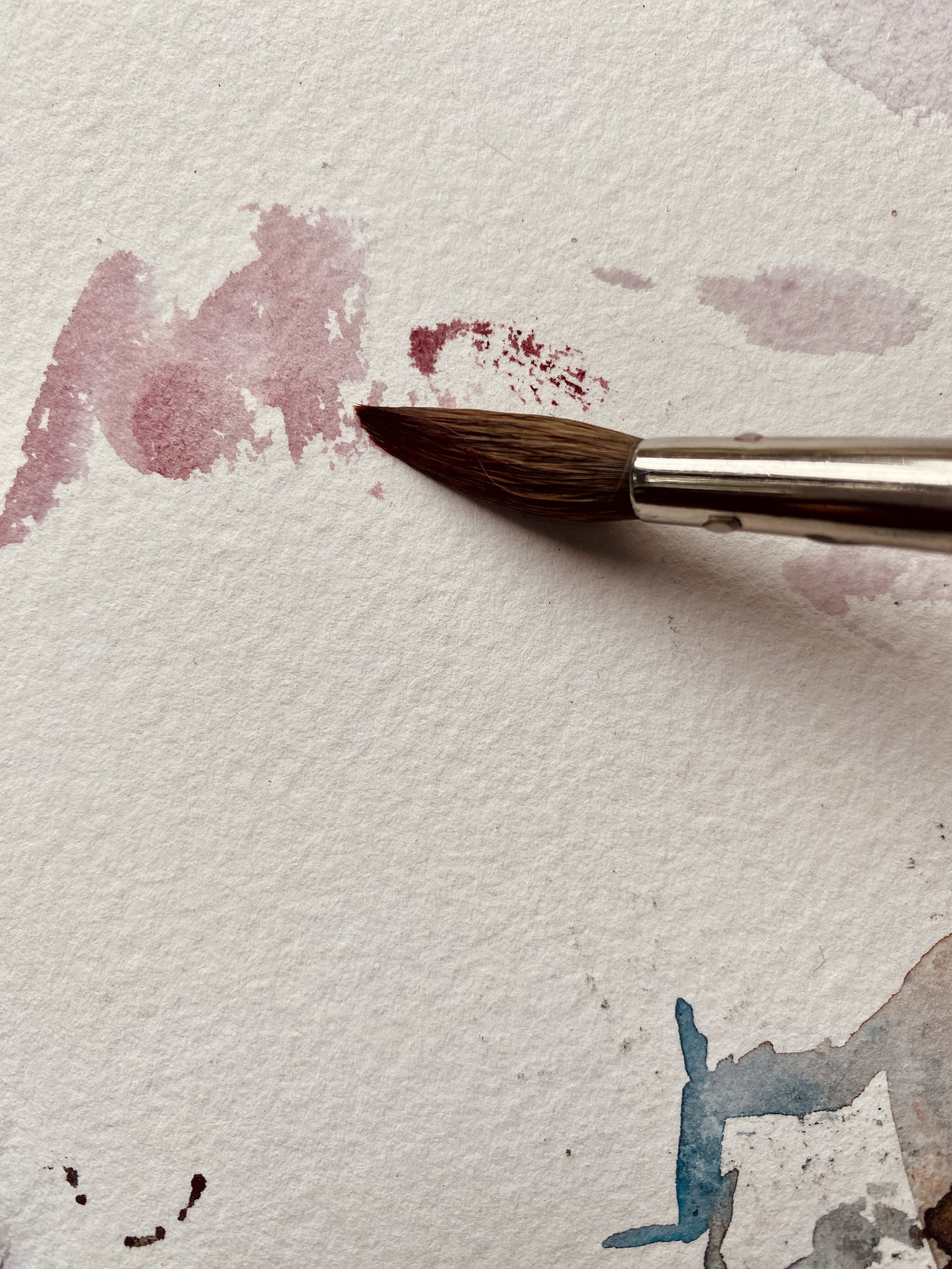
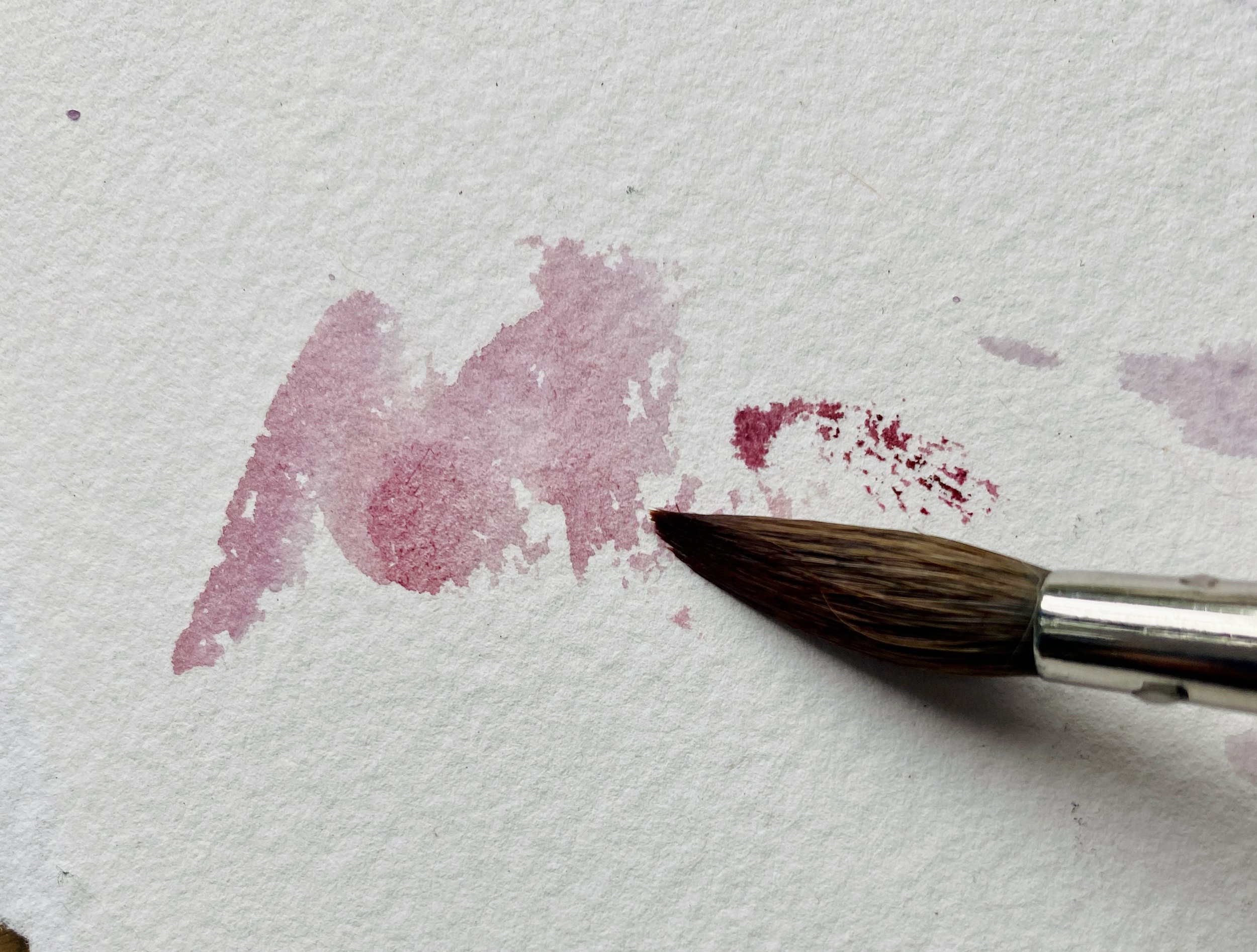
Water, paint, brush.
It was lovely. So lovely. The feeling was reminiscent of brushing the palm of my hand over the most luxuriously soft brand-new blanket. I was in love.
Why does the type of paper matter so much?
Science.
Water, pigments, surface tension, absorption, etc. Another day. Another blog. I can get pretty into this aspect of it.
In the simplest of explanations, watercolor is challenging enough, let’s not use paper that makes it harder.
There is more to it than that though. It’s the aesthetic. The loveliness of the process of tearing a fresh sheet of paper. It's fragility, yet flexibility. In watercolor the paint doesn’t just sit on the surface, it is taken in by the paper. The more layers and water you use, the more the two bond to each other. When I create pieces that use 20+ sweeping layers, the paper starts to transition and feel like fabric. The paint and paper become one. I love observing this evolution. There is a beautiful space where, as the artist, you can mediate or direct the process, while at the same time letting the medium do its magic. Paper is a part of this magic in the same way that the water and pigments are. Alright I have swooned enough.
If you are interested in the more detailed aspects of paper qualities please do read on as I will describe the different qualities you can look for when considering what to try. The options feel endless and I am far from having explored everything. Watercolor can be a tricky medium and being well versed in what to expect from your supplies can be a bonus. As you become more confident in your skills it can become more fun than frustrating to try new things. This will help you while starting out.
Paper Qualities:
Material
100% cotton. This is important to look for on the label. This is an easy automatic sign of a higher quality paper. Caveat: If practicing or just messing around use the cheap stuff!
Weight
Interesting nerd note: this number is the weight of the paper when 500 sheets are stacked on top of each other.
90 lb - This is the delicate bird of watercolor. Only meant for the lightest of water application. Good for botanicals and well, feeling delicate. I hardly use 90 lb at all but it is lovely when it has a nice, deckled edge.
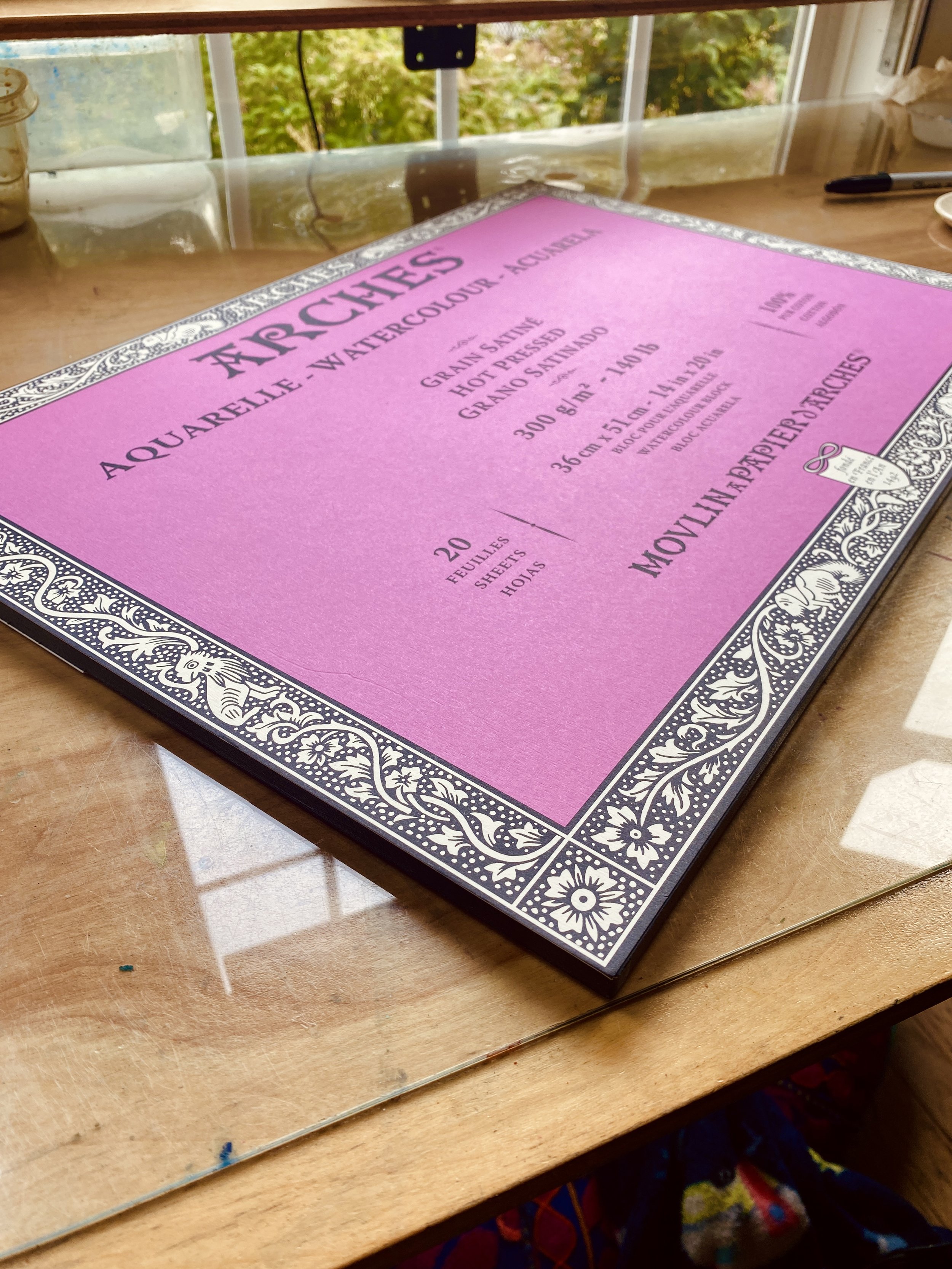
140 lb - This is what I would call your standard or average weight paper. Most people seem to land here. The price point is in the middle, and it has some decent weight to it. It can handle several wet-on-wet washes. If you like to use a lot of water, I recommend trying out a block (read further on). This paper highly benefits in being stretched if you wish to work with moderate amounts of water.
300 lb - My favorite and unfortunately, one of the most expensive weights of paper. This is the heavyweight, knockdown, drag out paper. It would take a lot of water to make this become wavy which is one of the reasons I gravitate to it. No stretching. I have gotten to the point where I don't even tape it to a board.
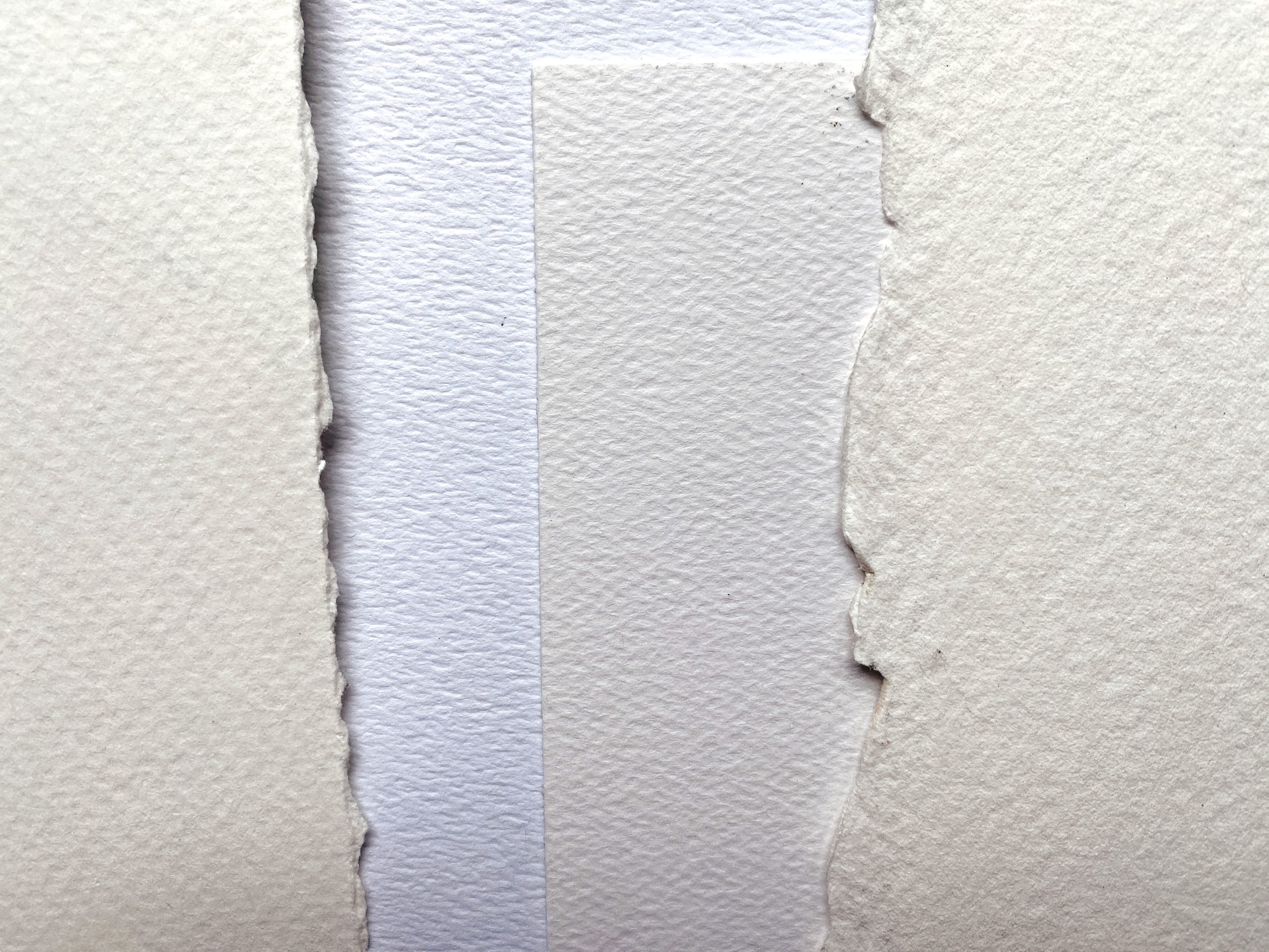
Texture
This is important in respect to your objective for an individual painting.
Cold Press - This is moderately textured. Higher quality papers will have more/better texture. This tends to be where a lot of people land as their go-to paper. It works well with dry brushing. It hides mistakes well. I mean how do you make a straight line with bumpy paper right?
Hot Press - Smooth as butter. I use this paper a lot. It is lovely for creating smooth transitional washes. It is not very forgiving though. I end up with more oil marks (from fingers) and scratch marks than with cold press. Not the easiest paper to start with, at least not exclusively.
Rough -This is very textured paper and can be fun to try out. Good for landscape work but not a go to for me.
Brand Specific “Pattern”
All paper has a “patten” that occurs from the creation of the paper. This is preferably very subtle. I painted on one piece of paper, that when finished, looked like I had painted over a window screen.
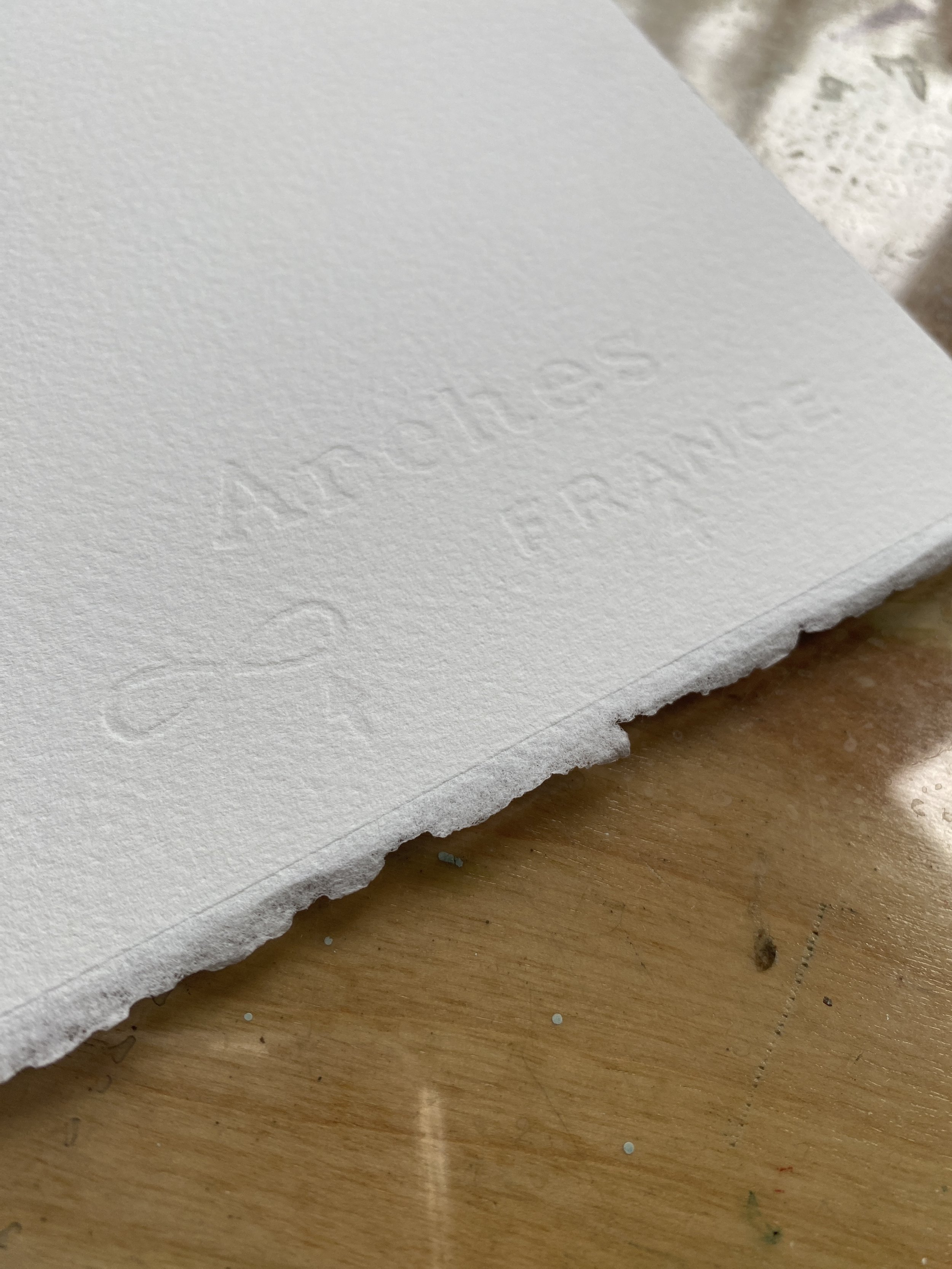
In general, the higher quality papers have a more natural (less pattern) look to them. They look more hand-crafted vs machine made. I find the more pattern to the paper, the more distracting it is to the final work. It is as simple as taking a closer look at the paper before buying or going with a well-known reputable brand if ordering online.
Color
I use both natural and bright white. I tend towards the bright white I think because I usually don’t leave a ton of pure unpainted paper in my work, so I don't find the need for the more natural tone. I also like to play a lot with value, and this can help me get that purest of white for high contrast.
Format
Sheets:
I prefer to buy my paper in full sheets. These are a standard size no matter what brand. They are 22 x 30 inches. I like the flexibility of tearing it down in multiple different sizes. I also like having a deckled edge (paper with unfinished edge on all sides). This makes for nice float framing.
A pitfall to full sheets is storage. Watercolor paper can be easily damaged and finding safe storage of that size can be challenging. You could of course tear it all down in advance. I have done that a few times but have found that I prefer to wait until I have officially decided on the size of a piece. I lucked out and already had a coffee table made from an old map filing cabinet. Otherwise sourcing large flat cardboard and sandwiching the paper is an option.
If you are new to watercolor, I would consider starting with pads and blocks. If you are ready to dive into the deep end, then it will be a must to search for a video on how to tear 300 lb paper. You will need a tear bar (most expensive) or a yard stick length metal ruler. Make sure it has cork on the back to prevent slipping.
Blocks:
Blocks are sheets of paper bound together with glue on all 4 sides. This helps to keep the paper flat and in theory, eliminate the need to stretch it. I find these to be quite effective until I start laying on wet-on-wet layers. Then come the hills and valleys. And with that come the ponds of paint. These are a more useful option for wet-on-dry painting. Blocks are also handy for plein air (painting outdoors) as you have a built-in board to work on.
You will likely want to have more than 1 block or additional other sources of paper in your arsenal. I often like to have multiple paintings going at once and all of the paper in the block is of course trapped until you remove the top sheet. Once you remove the top sheet you have thereby removed all benefits of the block.
Pads:
Pretty straight forward here. Paper glued together on only 1 side. Can be easily torn out and taped to a painting board.
Spiral Bound:
I think of paper in this format more for sketchbook work. Fun to have a small one to toss in your bag when traveling with a pocket paint palette. I am sure 300lb journals exist, but I have never looked for one. I mostly have owned 90 lb paper in this format. I focus more on finding one that is 100% cotton and has a nice natural tooth (texture) pattern. This is because I am usually sketching more and tend to use wet-on-dry for my application of paint.
After all this, I want to remind you that I fell in love with watercolor on paper that would have failed based on the following measures of quality. Sometimes we gotta work with what we got. No matter what my budget however, I would spend most of it on paper.
“Art Supply Store Day” is one I don’t think I will ever stop enjoying. And somehow buying that same 5 pack of 300 lb paper makes me pleased as punch.
May you all find the paper meant for you!